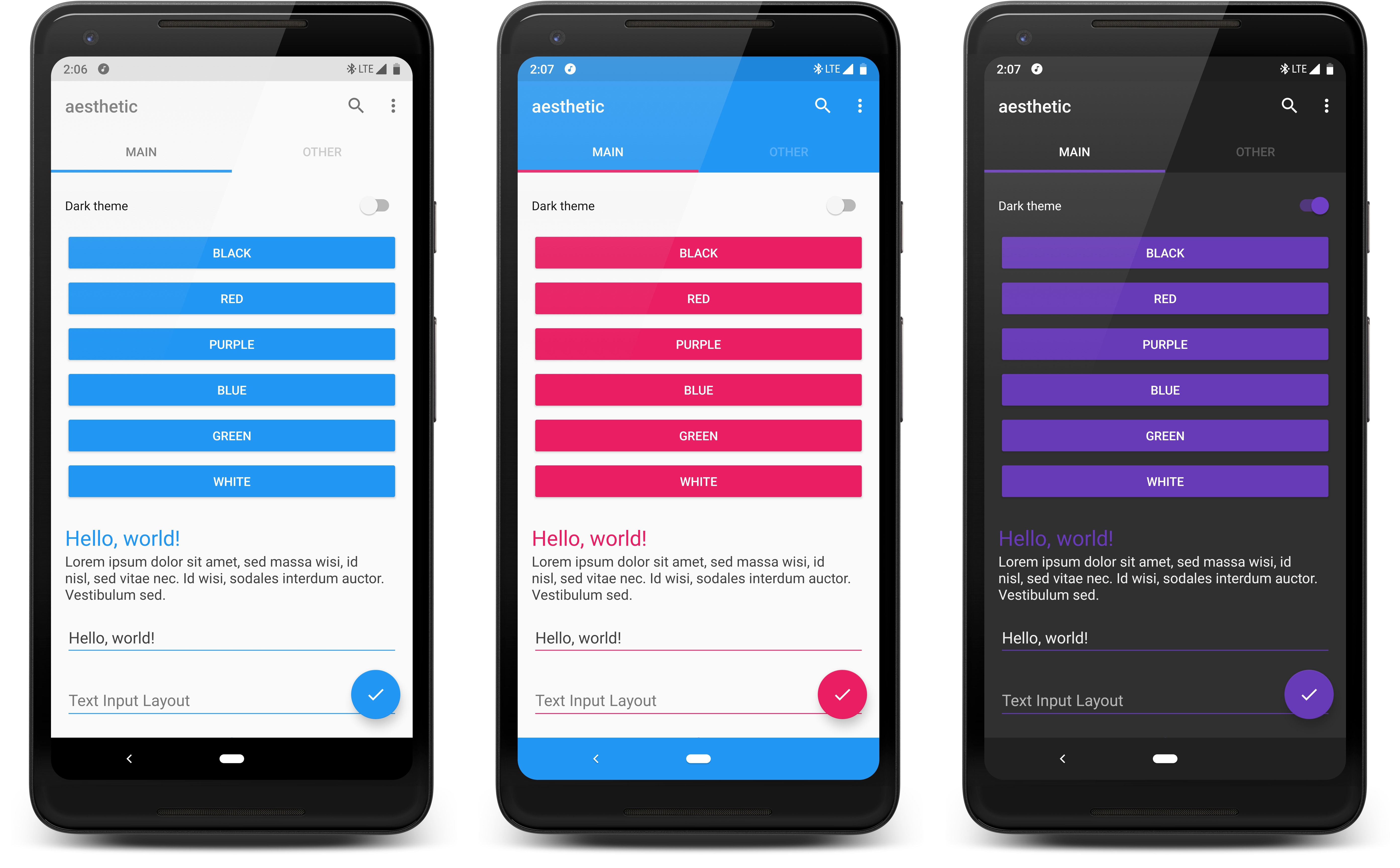
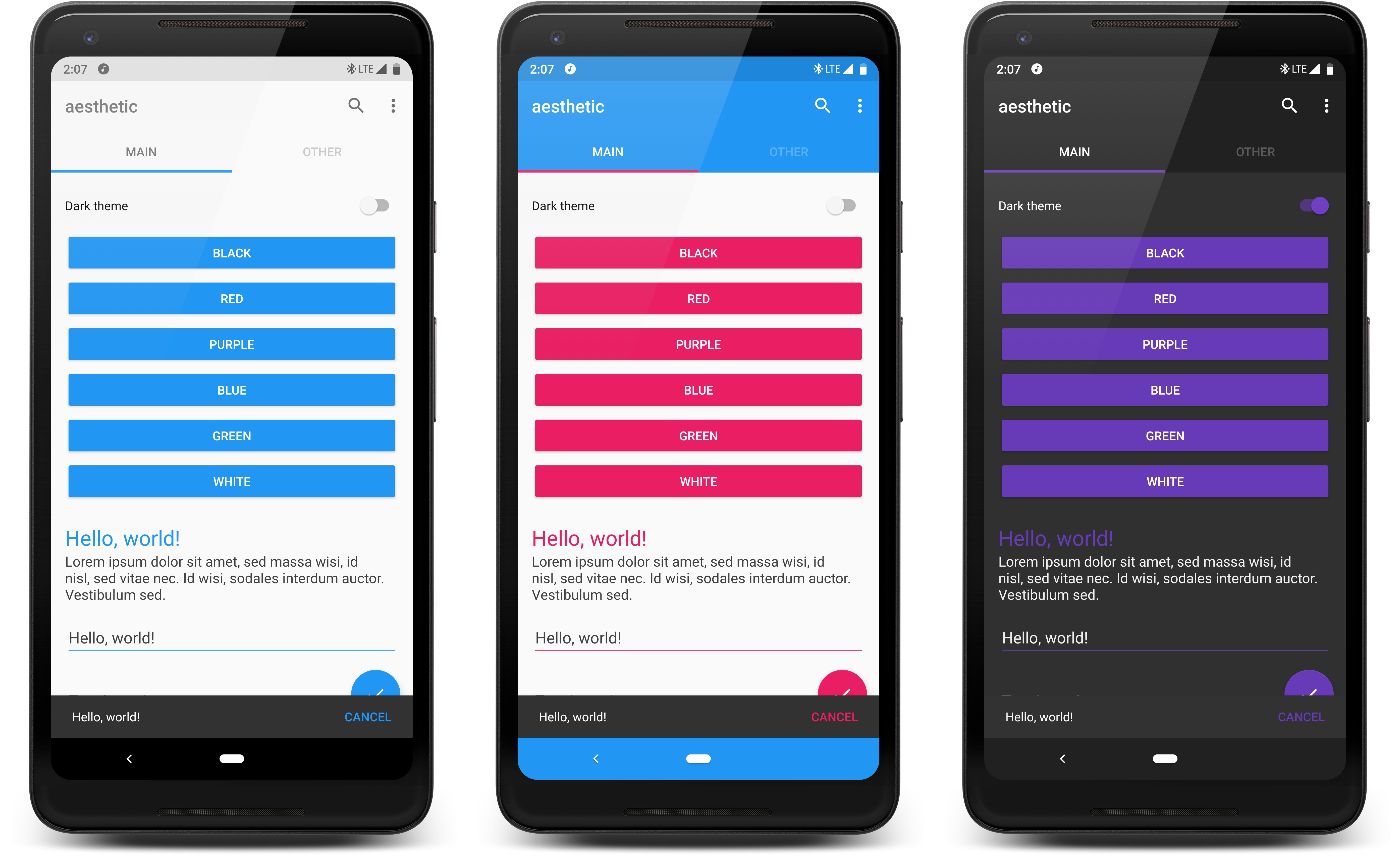
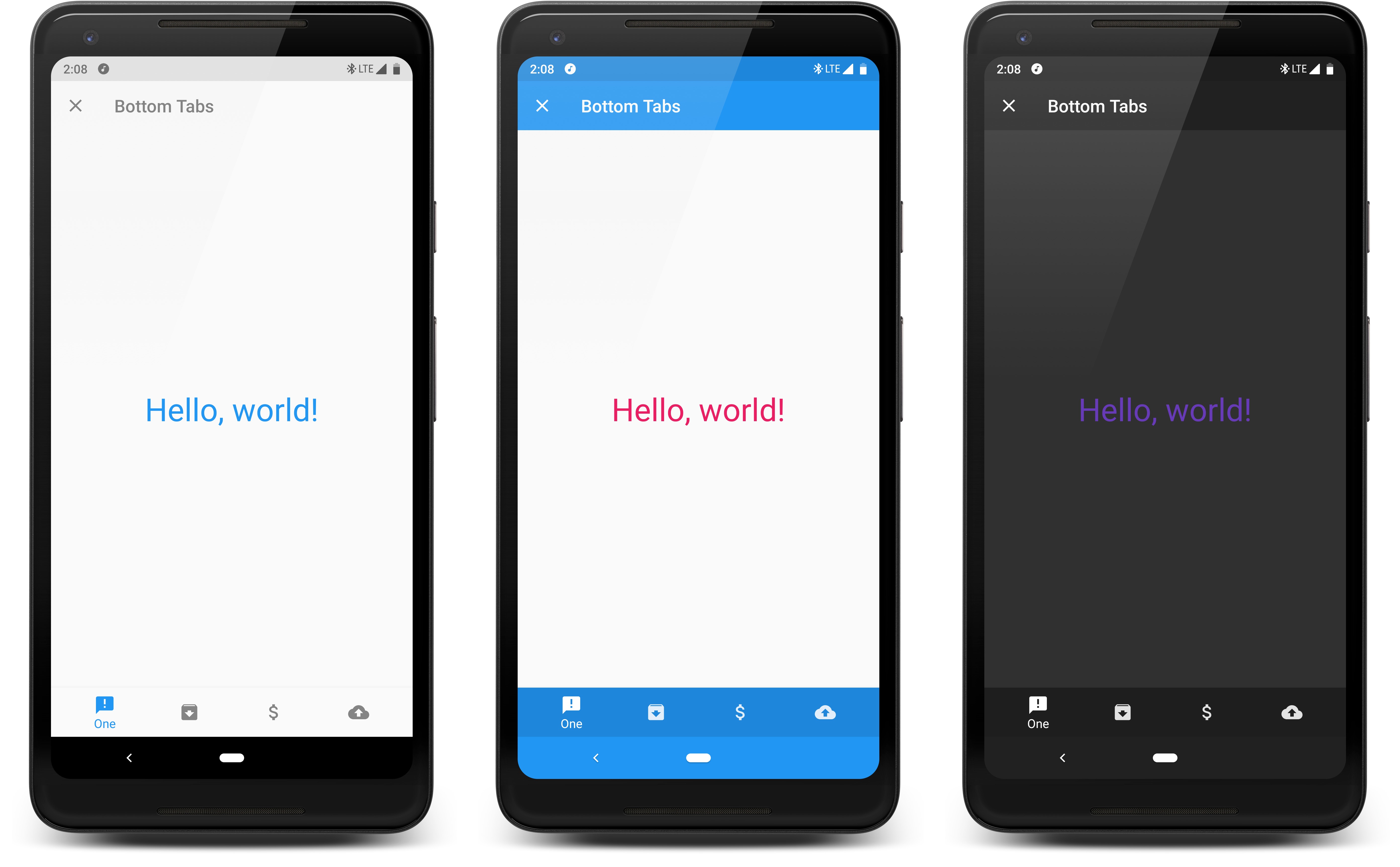
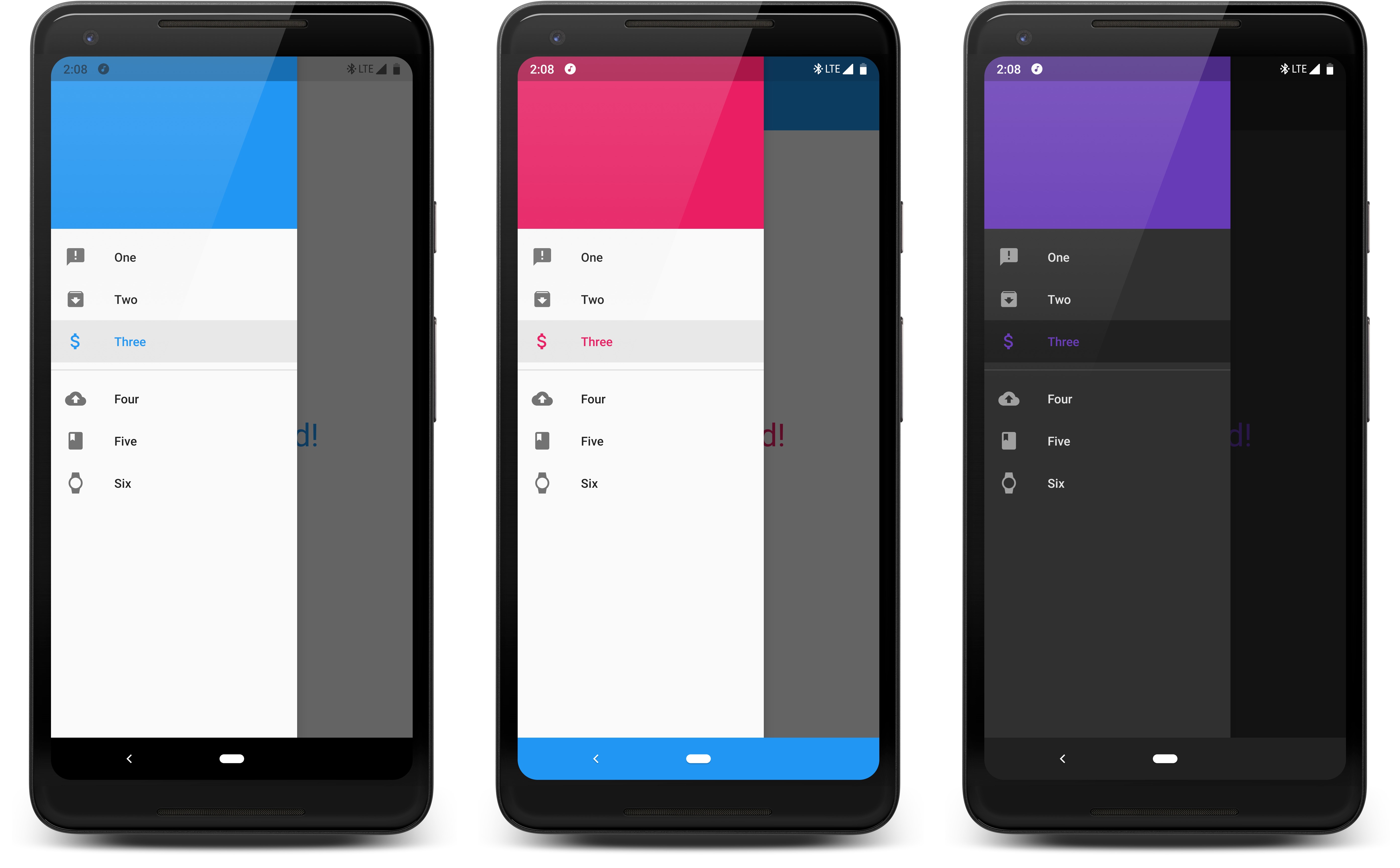
/esˈTHedik/: adjective, concerned with beauty or the appreciation of beauty.
You can download an APK of the sample project.
- Gradle Dependency
- Integration
- Configuration
- Attributes
- Advanced Views
- Custom Views and Manual Application
- Ignoring Views
Add this to your app module's build.gradle file:
dependencies {

  implementation 'com.afollestad:aesthetic:1.0.0-beta05'
}Aesthetic is integrated at a per-Activity level. The simplest way is
to have your Activities extend AestheticActivity.
class MyActivity : AestheticActivity() {

  override fun onCreate(savedInstanceState: Bundle?) {
    super.onCreate(savedInstanceState)
  }
}
If you don't want to or cannot extend this class, you can manually tell Aesthetic about lifecycle events:
class MyActivity : AppCompatActivity() {

  override fun onCreate(savedInstanceState: Bundle?) {
    Aesthetic.attach(this)  // MUST come before super.onCreate(...)
    super.onCreate(savedInstanceState)
  }

  override fun onResume() {
    super.onResume()
    Aesthetic.resume(this)
  }

  override fun onPause() {
    Aesthetic.pause(this)
    super.onPause()
  }
}Aesthetic provides a isFirstTime field which returns true until
you apply theme configuration at least once.
You can use this to setup defaults on app launch.
class MyActivity : AestheticActivity() {

  override fun onCreate(savedInstanceState: Bundle?) {
    super.onCreate(savedInstanceState)

    // If we haven't set any defaults, do that now
    if (Aesthetic.isFirstTime) {
        Aesthetic.config {
          ...
        }
    }
  }
}
There are two ways to "configure" Aesthetic, with the config method:
Aesthetic.config {
  colorPrimaryRes(R.color.blue)
  ...
}
Or by chaining the setters and calling apply():
Aesthetic.get()
  .colorPrimaryRes(R.color.blue)
  ...
  .apply() // don't forget apply() with this way
If you are using Java, you cannot use the config method.
Attributes are the foundation of this library. They link your UI to dynamically changing colors.
Attributes exist natively on Android, but they are not dynamic - they are rather set in your Activity themes and are pre-determined at compile-time. This library gets around that.
Aesthetic.config {
  // Set to false for light themes, true for dark.
  // By default, is based on whether textColorPrimary is light/dark.
  isDark(false)

  // Causes an Activity recreate, calls setTheme(Int) on it.
  activityTheme(R.style.MyActivityTheme)

  // ON makes status bar icons black, and vice versa. AUTO bases it on
  // the status bar color, e.g. white -> light mode, black -> normal mode.
  // This has no effect below API 23 (Marshmallow).
  lightStatusBarMode(AutoSwitchMode.AUTO)

  // ON makes navigation bar icons black, and vice versa. AUTO bases it on
  // the navigation bar color, e.g. white -> light mode, black -> normal mode.
  // This has no effect below API 26 (Oreo).
  lightNavigationBarMode(AutoSwitchMode.AUTO)
}Aesthetic.config {
// ?colorPrimary, used for Toolbars, etc.
colorPrimaryRes(R.color.blue)
// ?colorPrimaryDark, used for status bars, etc.
colorPrimaryDark(R.color.blue)
// ?colorAccent, used for input fields, buttons, etc.
colorAccentRes(R.color.blue)
// Defaults to colorPrimaryDark.
colorStatusBarRes(R.color.blue)
// Sets to colorPrimaryDark.
colorStatusBarAuto()
// Defaults to the value in your activity theme, or black.
colorNavigationBarRes(R.color.blue)
// Sets nav bar color to match ?colorPrimaryDark.
// If the color is light and light nav bar mode is disabled, it is forced to black.
colorNavigationBarAuto()
// Defaults to the value in your activity theme.
colorWindowBackgroundRes(R.color.blue)
}The methods which end with Res take a color resource. Remove Res to
pass a literal (hardcoded) color integer.
Aesthetic.config {
  // ?android:textColorPrimary
  textColorPrimaryRes(R.color.black)
  // ?android:textColorSecondary
  textColorSecondaryRes(R.color.dark_gray)

  // ?android:textColorPrimaryInverse
  textColorPrimaryInverseRes(R.color.white)
  // ?android:textColorSecondaryInverse
  textColorSecondaryInverseRes(R.color.light_gray)
}
The methods which end with Res take a color resource. Remove Res to
pass a literal (hardcoded) color integer.
All of the "attributes" shown and used in examples above are shown with shortcut methods that
assign a color to a specific pre-existing attribute, such as colorPrimary from AndroidX.
You can define custom attributes that are usable in layouts. You can assign colors to theme like you would the predefined attributes above.
First, you need to define the attribute in /values/attrs.xml:
<resources>
  <attr format="color" name="my_custom_attr"/>
</resources>
Then you need to define a default in your Activity's theme so that Android's LayoutInflater can resolve something initially:
<style name="MyActivityTheme" parent="Theme.AppCompat.Light">
  <item name="my_custom_attr">#000000</item>
</style>
You can use this attribute in your layouts:
<TextView
  android:layout_width="match_parent"
  android:layout_height="wrap_content"
  android:text="Hello, World!"
  android:textColor="?my_custom_attr"
  />
And you can assign dynamic values to it with Aesthetic:
Aesthetic.config {

   attributeRes(R.attr.your_attribute, R.color.blue)
}
The methods which end with Res take a color resource. Remove Res to
pass a literal (hardcoded) color integer.
To make Aesthetic a bit more plug-and-play, and to support views that can't necessarily be color-themed from XML, additional options are available for certain types of views.
Special properties are provided for Toolbar icons (navigation icon, overflow icon, etc.) and the
title and subtitle colors, so that they don't have to be paired with textColorPrimary, etc.
Aesthetic.config {

  // Defaults to black or white based on the darkness of ?colorPrimary.
  toolbarIconColorRes(R.color.white)

  // Defaults to black or white based on the darkness of ?colorPrimary.
  toolbarTitleColorRes(R.color.white)
  // Defaults to a faded version of the title color.
  toolbarSubtitleColorRes(R.color.light_gray)
}
You can override these (not including the icon color) at a per-layout basis as well:
<androidx.appcompat.widget.Toolbar
  ...
  android:background="?some_color"
  app:titleTextColor="?some_color"
  app:subtitleTextColor="?some_color"
  />
If you do not manually override background, the Toolbar will automatically
default to the value of ?colorPrimary.
Aesthetic.config {
  // The color of the main text on a Snackbar
  snackbarTextColorDefault()
  snackbarTextColorRes(R.color.white)

  // The color of the action on a Snackbar, if there is one.
  snackbarActionTextColorRes(R.color.blue)

  // The background color of Snackbar.
  snackbarBackgroundColorDefault()
  snackbarBackgroundColorRes(R.color.dark_gray)
}Aesthetic.config {
// The background of CardViews is different because of the
// rounding and elevation. This supports those elements.
colorCardViewBackgroundRes(R.color.white)
}Note: the color of text and icons in tab layouts will match that of Toolbars (using the
toolbarIconColor and toolbarTitleColor attributes).
Aesthetic.config {
  // The selected tab's underline will be the primary color.
  tabLayoutIndicatorMode(ColorMode.PRIMARY)
  // The selected tab's underline will be the accent color.
  tabLayoutIndicatorMode(ColorMode.ACCENT)

  // The tab layout's background will be the primary color.
  tabLayoutBackgroundMode(ColorMode.PRIMARY)
  // The tab layout's background will be the accent color.
  tabLayoutBackgroundMode(ColorMode.ACCENT)
}Aesthetic.config {
// The tabs' background will be black or white based on the darkness
// of the overall theme.
bottomNavigationBackgroundMode(BottomNavBgMode.BLACK_WHITE_AUTO)
// The tabs' background will be the primary color.
bottomNavigationBackgroundMode(BottomNavBgMode.PRIMARY)
// The tabs' background will be the dark primary color.
bottomNavigationBackgroundMode(BottomNavBgMode.PRIMARY_DARK)
// The tabs' background will be the accent color.
bottomNavigationBackgroundMode(BottomNavBgMode.ACCENT)
// This library will not do any automatic background color theming of bottom nav views.
bottomNavigationBackgroundMode(BottomNavBgMode.NONE)
// The selected tab's icon will be tinted with the primary color.
bottomNavigationIconTextMode(BottomNavIconTextMode.SELECTED_PRIMARY)
// The selected tab's icon will be tinted with the accent color.
bottomNavigationIconTextMode(BottomNavIconTextMode.SELECTED_ACCENT)
// The selected tab's icon will be tinted black or white based on
// the darkness of the overall theme.
bottomNavigationIconTextMode(BottomNavIconTextMode.BLACK_WHITE_AUTO)
// This library will not do any automatic icon/text theming of bottom nav views.
bottomNavigationIconTextMode(BottomNavBgMode.NONE)
}Aesthetic.config {
// The selected drawer item will be tinted with the primary color.
navigationViewMode(NavigationViewMode.SELECTED_PRIMARY)
// The selected drawer item will be tinted with the accent color.
navigationViewMode(NavigationViewMode.SELECTED_ACCENT)
// This library will not apply any auto theming to NavigationViews.
navigationViewMode(NavigationViewMode.NONE)
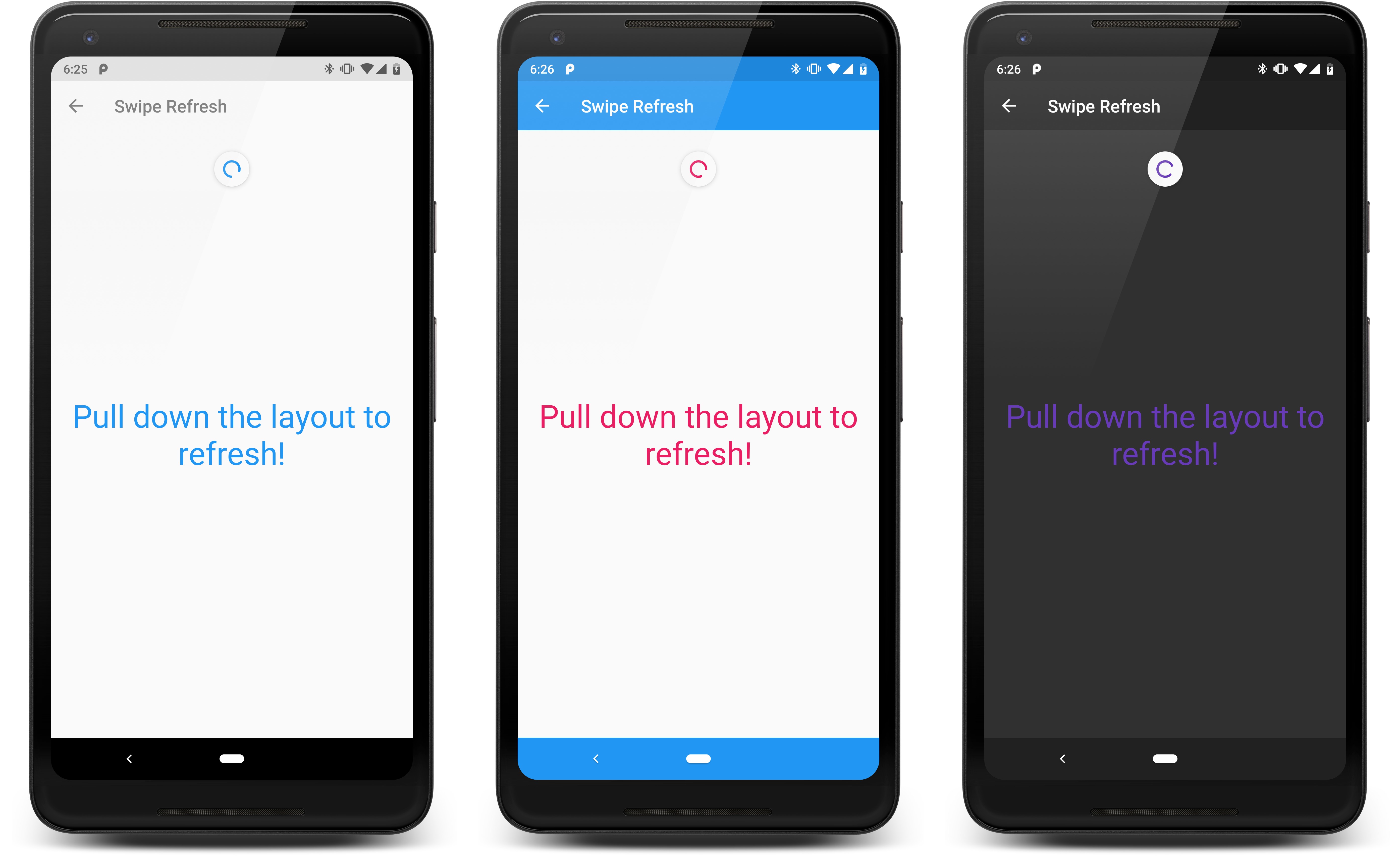
}Aesthetic.config {
// You can pass one more more comma-separated colors.
// The colors that the refreshing indicator rotates through in a loop.
swipeRefreshLayoutColorsRes(R.color.red, R.color.blue)
}Aesthetic will not automatically theme most custom views, with some exceptions such as background color, text color, hint text color, an image view tint (these are handled without swapping view types).
Aesthetic makes it easy to subscribe to color changes so that you can manually apply colors to
views that need them.For an example, you can subscribe to pre-defined attributes, such as colorPrimary():
val subscription = Aesthetic.get()
  .colorPrimary()
  .subscribe { color ->
      // Use color (an integer)
  }

// Later, you should unsubscribe, e.g. when your Activity pauses or your View detaches from its Window
subscription.dispose()
If you only need the latest value and no further updates:
Aesthetic.get()
  .colorPrimary()
  .take(1)
  .subscribe { color ->
      // Use color (an integer)
  }
You can do the same with custom attributes by switching colorPrimary() with
attribute(R.attr.your_attr).
You can even setup an inflation delegate to auto-swap views at inflation time, like Aesthetic does with a lot of stock/AndroidX views. This delegate is not called for views that Aesthetic already swaps internally.
class MyInflationDelegate : InflationDelegate {

  override fun createView(
    context: Context,
    attrs: AttributeSet?,
    name: String,
    viewId: Int
  ): View? = when (name) {
    "com.somelibrary.CustomView" -> ThemedCustomView(context, attrs)
    else -> null
  }
}

Aesthetic.setInflationDelegate(MyInflationDelegate())You can make this library ignore specific views from being themed with tags:
// Can also be set in you layout XML
view.setTag(":aesthetic_ignore")

view.setTag(R.id.aesthetic_ignore, "anything other than null")

