Open
Description
border-radius我相信对于老一辈的前端们有着特殊的感情,在经历了没有圆角的蛮荒时代,到如今 CSS3 遍地开花,我们还是很幸福的。
然而即使到了三星大脸流行时代,border-radius在移动端的表现依旧差强人意,主要有以下几点问题:
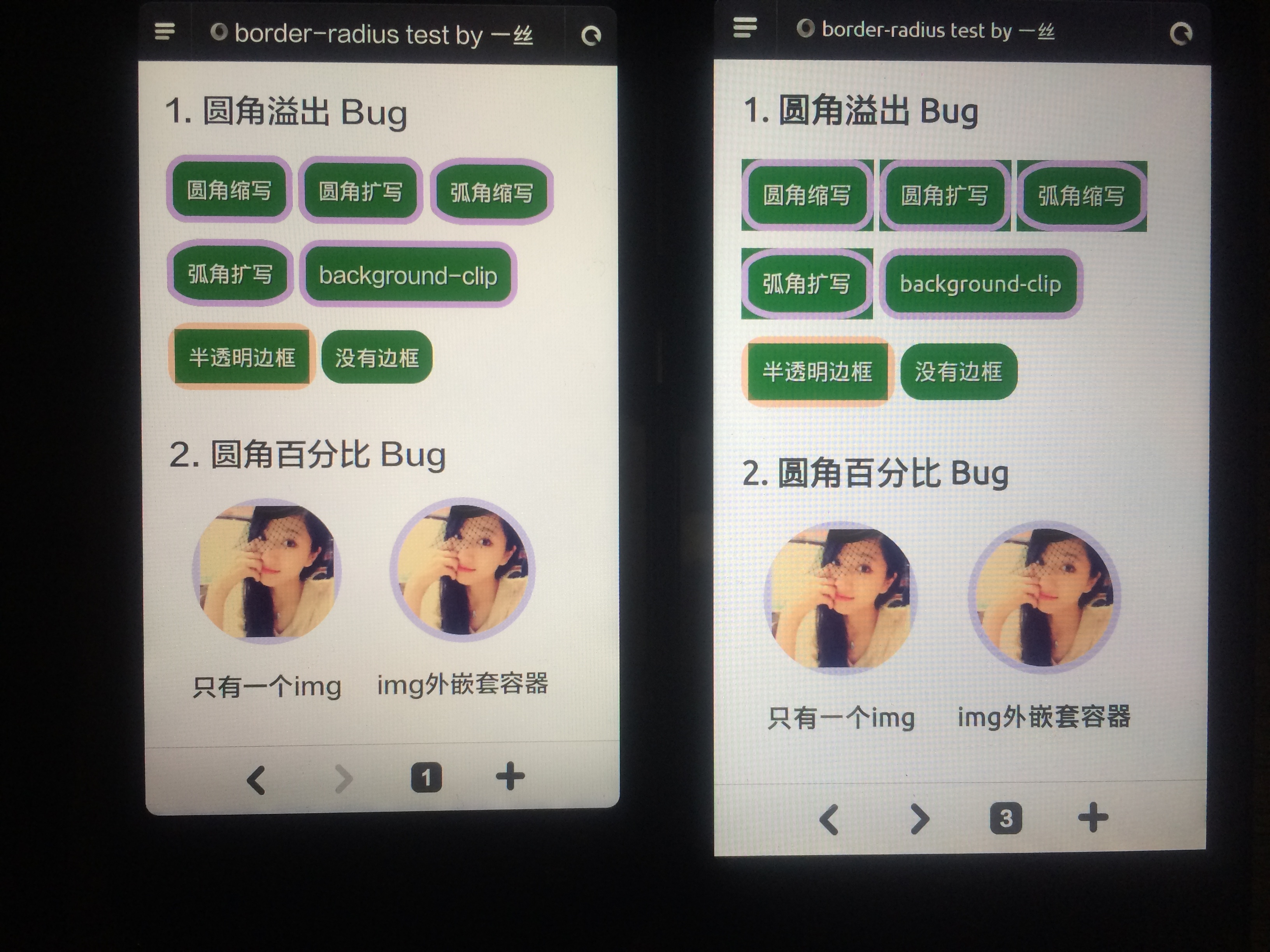
一、Android 2.3 自带浏览器不支持 %
通常我们实现一个正圆只需要border-radius: 50%即可,大致代码如下:
.foo {
    width: 100px;
    height: 100px;
    border-radius: 50%;
    border: 1px solid blue;
}
然而 Android 2.3 是不支持百分比的,要兼容我们只能使用一个较大值,比如border-radius: 999px;
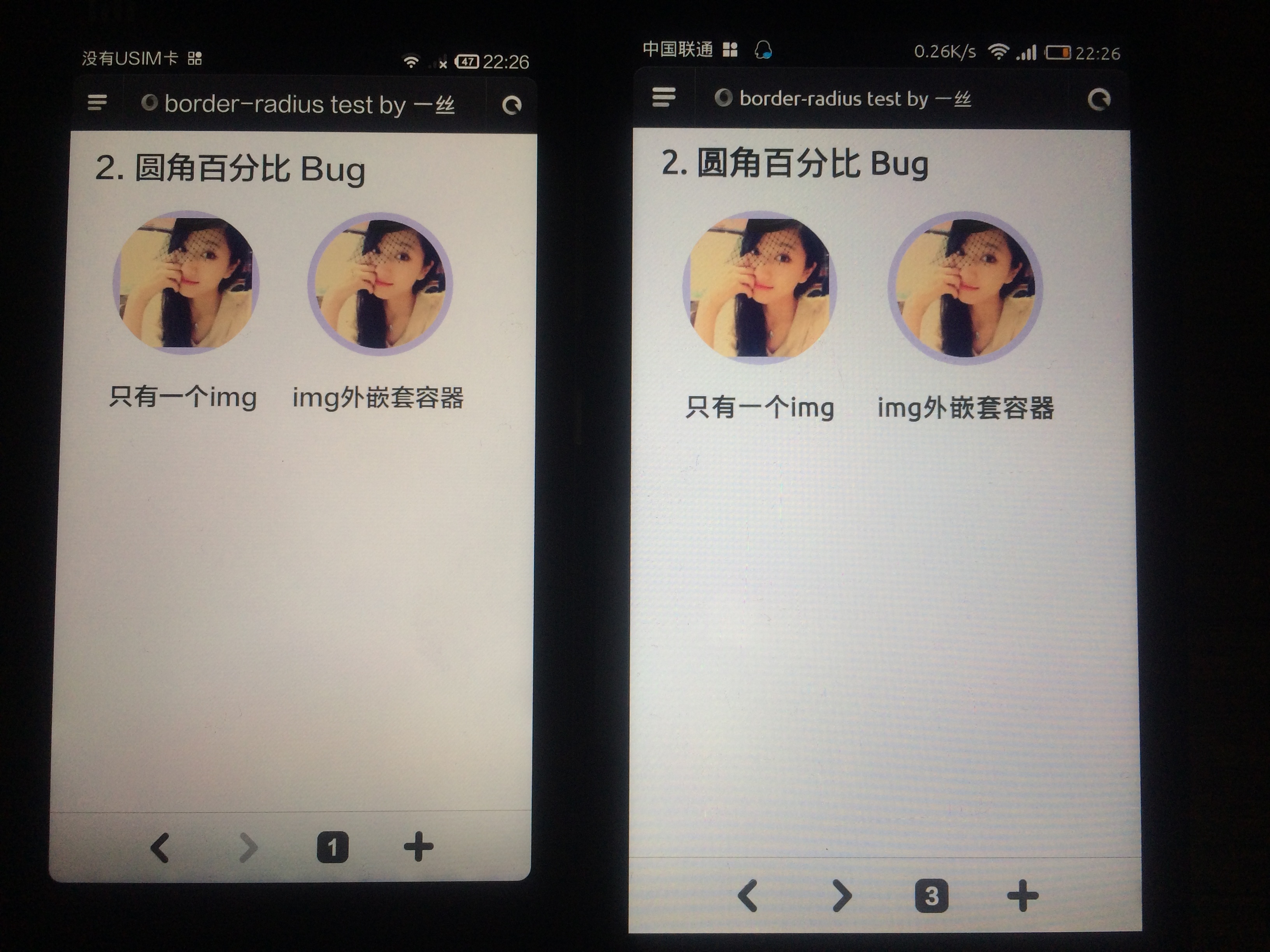
二、Android 及 Safari 低版本 img 圆角问题
当 img 元素有border 时设置border-radius 会导致圆角变形,需要在img 外面嵌套一个元素并设置border 和border-radius。
测试发现,在 Android 4.2.x 系统自带浏览器中,同时设置border-radius和背景色的时候,背景色会溢出到圆角以外部分,需要是使用background-clip: padding-box;来修复,但是如果border-color为半透明时,背景直角部分依然会露出来(参见图一)。
3.2 Android 4.2.x 不支持border-radius缩写
这个 BUG在小米上测试并未发现,国外有人反映三星 Galaxy S4 中自带浏览器不支持。
解决方案就是使用border-radius的四个扩写属性,缩写属性放到最后。
以上两个问题影响到 Android 4.2.x 内核的系统以及在其基础上定制的系统的自带浏览器,比如:红米,小米3,阿里云OS 等,安卓版 Chrome 不受影响。
完整代码应该是这样的:
.foo {
    width: 100px;
    height: 100px;
    border: 5px solid blue;
    border-top-left-radius: 999px; /* 左上角 */
    border-top-right-radius: 999px; /* 右上角 */
    border-bottom-right-radius: 999px; /* 右下角 */
    border-bottom-left-radius: 999px; /* 左下角 */
    border-radius: 999px;
    background-color: #ccc;
    background-clip: padding-box;
}
四、其他问题
- IE9 中
fieldset元素不支持border-radius。 - IE9 中带有背景渐变(gradient)的时候背景溢出。
全部 Demo 截图:
感谢@方元 同学帮忙测试,欢迎反馈更多移动端 CSS 的问题。
转载请注明出处:https://github.com/yisibl/blog/issues/2
Metadata
Metadata
Assignees
Labels
No labels
Projects
Milestone
Relationships
Development
No branches or pull requests
Participants
Activity
chyingp commentedon Feb 25, 2014
看完整个人都不好了~~感谢撸主分享 :)
yuanyan commentedon Feb 25, 2014
是 Samsung Galaxy S4 with Android 4.2 不支持 shorthand 的写法
alianrock commentedon Feb 25, 2014
刚刚在4.1.2的手机上又试了一下,发现不但要在div加border-radius,还要在img加border-radius,不然也会出现问题。
img{
display: block;
width: 100%;
border-radius: 999px;
}
div{
width: 200px;
height: 200px;
overflow: hidden;
border: 3px solid #000;
border-radius: 999px;
}
loskael commentedon Feb 26, 2014
提供一个测试样本
Mozilla/5.0 (Linux; U; Android 4.2.1; zh-cn; HUAWEI G520-T10 Build/HuaweiG520-T10) AppleWebKit/534.30 (KHTML, like Gecko) Version/4.0 Mobile Safari/534.30 V1_AND_SQ_4.6.1_9_YYB_D QQ/4.6.1.1551
支持缩写, 需要加 background-clip: padding-box;
yisibl commentedon Feb 26, 2014
@yorts52 感谢,华为的自带浏览吗?
loskael commentedon Feb 26, 2014
是的
music60 commentedon Mar 7, 2014
background-image: -webkit-gradient(linear, left top, left bottom, from(#背景色), to(#背景色)); /* Chrome, Safari 4+ /
background-image: -webkit-linear-gradient(top, #背景色, #背景色); / Chrome 10-25, iOS 5+, Safari 5.1+ /
background-image: -moz-linear-gradient(top, #背景色, #背景色); / Firefox 3.6-15 /
background-image: -o-linear-gradient(top, #背景色, #背景色); / Opera 11.10-12.00 /
background-image: linear-gradient(to bottom, #背景色, #背景色); / Chrome 26, Firefox 16+, IE 10+, Opera 12.10+ */
加上面的代码也可以把背景色溢出给消去,我之前都用上面的,楼主的方法比我的简单多了,受教了
ximan commentedon Mar 18, 2014
图挂了为什么没人反馈一下?是我的问题吗?
yisibl commentedon Mar 18, 2014
@ximan 已更新,Thx!
syrxw commentedon Mar 18, 2014
兼容是前端最头痛的。。
hermione521 commentedon Apr 23, 2014
感谢lz!解决了ios5上微信内置浏览器的问题!
paicha commentedon Jun 30, 2014
感谢。
tonyssc commentedon Aug 19, 2014
3.1 Android 4.2.x 背景色溢出
这个问题暂时可以使用背景渐变(gradient)代替background-color来解决,设置相同的渐变色。
12 remaining items
aototo commentedon Oct 15, 2015
@yisibl mask也已经阵亡!知道img带有animation android下是不行的!
kujian commentedon Dec 30, 2015
mark,原来还有这么多bug
kujian commentedon Dec 30, 2015
写了这么多bug,可否总结出一个比较安全的写法呢?
yisibl commentedon Dec 30, 2015
@kujian 每个 bug 后面都列出了解决方法,例如:
mc-zone commentedon Dec 30, 2015
顶,这个问题很早就遇到过,之前也找过解决方案,最后也是找到了 mask-image。
当时还记录了下:
jsFiddle
kujian commentedon Jan 11, 2016
@yisibl ok,get it.
yisibl commentedon Jan 26, 2016
有网友反应在 Android<4.4 的 WebView 中,border-*-width 4096px 将变为 0px。
https://twitter.com/RReverser/status/691714158757179396
anchengjian commentedon Mar 24, 2016
我之前用::before去生成backgroud,然后元素本身加border,再同时把两个都设置一样的border-radius。。。解决圆角溢出问题,看了文章后觉得这个方法简直蠢到爆啊。。。。
beforeload commentedon May 30, 2016
@mc-zone mask-image 貌似在oppo android 4.2 机型上不生效。场景如 @zhouqicf 描述一致。
gaofant101 commentedon May 30, 2016
我也遇到border-radius: 50%背景溢出(华为=4.2.2),令人搞不懂的是box-shadow、border这2个样式是圆角的(而且在别的地方border-radius: 50%确实是圆角),查了一些方法都不可行,用了这里面的方法看起来是解决了,但是看起来还是像一个椭圆;
charrysong commentedon Jul 11, 2016
用了position:absolute;会有边 白色是background:#fff;X是图片。

cdll commentedon Oct 26, 2016
华为3c给跪了 T_T
pspgbhu commentedon Feb 17, 2017
感谢。刚好遇到了这个问题。
zhangfaliang commentedon Apr 24, 2018
解决一切 虽然不知道意思